Social Wall
  Feed Analytics

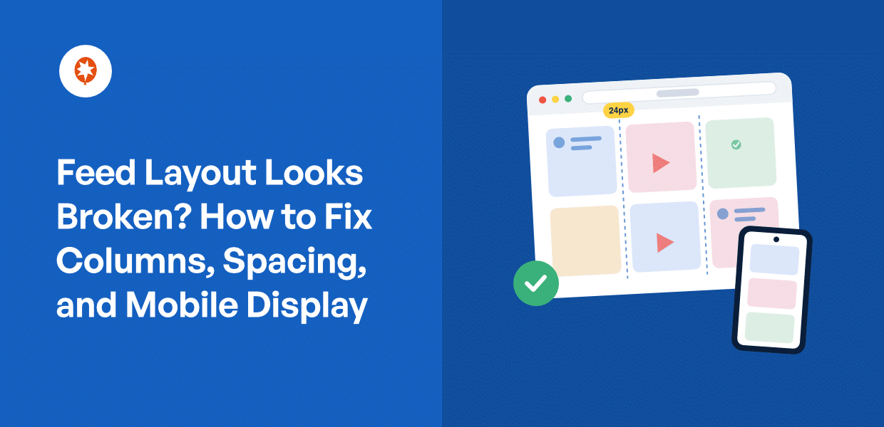
Your feed showed your posts fine yesterday. Today it looks off.
Maybe the columns collapsed into one. Maybe your images look squashed or stretched. Maybe the spacing vanished, or the whole thing flashes unstyled for a second before snapping into place. It still shows your content. It just looks wrong, especially on mobile.
If you’ve hit this, don’t worry. It’s almost never a real bug. It’s a settings issue, and you can fix it without touching a single line of code, even if you’re not a developer.
Once you know which cause matches your symptom, the fix is often a single click.
So let’s match what you’re seeing to the setting that fixes it. We’ll sort out columns, spacing, and mobile display in that order, so you fix the setting first and skip the CSS you probably don’t need.
- Why Does My Feed Look Broken or Unstyled? (Quick Answer)
- Match Your Symptom to the Cause (Start Here)
- Fix Your Column Count and Spacing
- Fix Mobile-Specific Layout Issues
- When Your Theme Is Overriding the Feed's Styling
- Fix It With the AJAX Theme Loading Fix
- Safe Custom CSS Overrides That Won't Break Your Theme
- A Feed That Actually Matches Your Site
Why Does My Feed Look Broken or Unstyled? (Quick Answer)
Your feed isn’t broken. It’s almost always one of three settings issues.
- Your layout was never adjusted for the space. The column count or spacing still sits at the default, so posts crowd or collapse.
- Your theme is overriding the feed’s styles. Your theme’s CSS wins, and the feed loses its intended look.
- A theme-load conflict blocks the styles on load. That’s the “flash unstyled, then snap into place” symptom.
Here’s the reassuring part. You fix these inside the feed’s own settings, and most people never need to touch a stylesheet. No coding needed.
Match Your Symptom to the Cause (Start Here)
Before you change anything, name what you see.
Every layout problem has a most likely cause. Match your symptom to it, and you skip straight to the one fix that matters.
Here are the most common causes, in the order worth checking them.
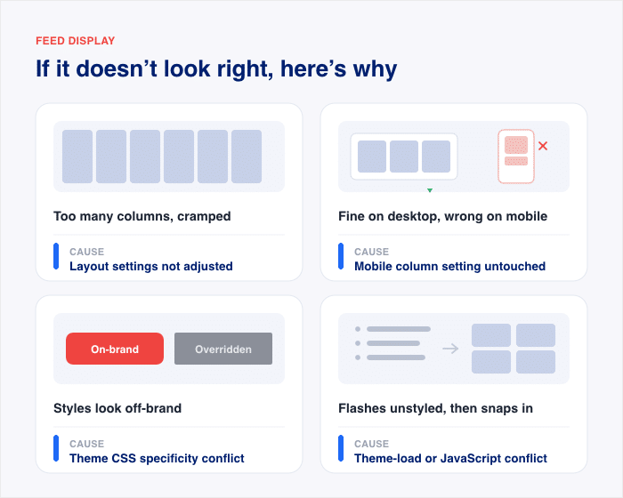
| What you see | Most likely cause | Where to go |
|---|---|---|
| Too many or too few columns, cramped spacing | Layout settings not adjusted | Fix Your Column Count and Spacing |
| Looks fine on desktop, wrong on mobile | Separate mobile column setting untouched | Fix Mobile-Specific Layout Issues |
| Feed styles look overridden or off-brand | Theme CSS specificity conflict | When Your Theme Is Overriding the Feed’s Styling |
| Flashes unstyled, then snaps into place | Theme-load or JavaScript conflict | Fix It With the AJAX Theme Loading Fix |
Now, the order.
Check settings first. That’s the top two rows. Desktop columns and mobile display both live in the settings. Then a theme conflict. Then a load conflict. Custom CSS comes last, if at all.
That order isn’t random. It goes from the fix that solves the most cases to the one that solves the fewest.
Here’s what most people get wrong. They see a broken feed and jump straight to custom code. They start writing CSS to force the layout into place.
Don’t do that yet. In most cases, a built-in setting or a single checkbox fixes the exact same thing. Checking in this order saves you from writing CSS you don’t need.
So find your symptom in the table. Go to that section. Fix it there.
Fix Your Column Count and Spacing
Too many columns? Too few? Posts crammed together with no breathing room?
It’s almost always the column count and spacing sitting at their defaults, and it’s pretty easy to fix using the live customizer that comes with every Smash Balloon plugin.
You set the rows and columns, watch the feed update in a live preview, and save your changes.
Here’s how to set your columns and spacing.
- In your WordPress dashboard, open your feed and click Customize.
- Click the Layout tab.
- Find the column count control. Set your columns for desktop, tablet, and mobile. Each screen size has its own setting.
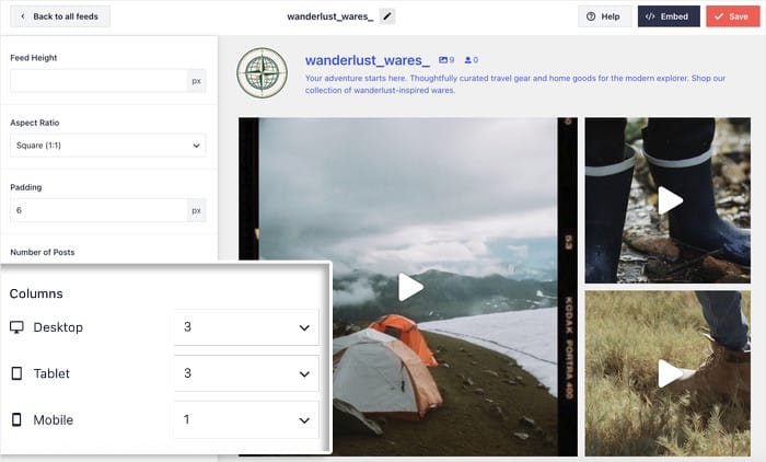
- For Instagram feeds, set the Padding value to change the space between posts.
- Click on “Save”.
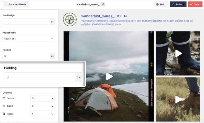
Want a clean 3-across grid on desktop? Set desktop columns to 3. That’s the whole fix.
The Layout tab also controls image shape. You can set your posts to a 1:1 square, a 4:5 portrait, or a 3:4 aspect ratio. This is handy when your images look squashed or stretched, since a matching aspect ratio crops them cleanly.
Fix Mobile-Specific Layout Issues
Your feed can look perfect on desktop. On your phone, it might be a mess.
Here’s why. The mobile column setting is separate from the desktop one. Changing desktop columns does nothing to mobile.
So a feed set to 4 columns on desktop tries to squeeze all 4 onto a narrow phone screen. Now each image is a tiny sliver. Everything feels cramped and squished together.
The fix is to set mobile columns on their own. Head to the same Layout tab you used before.
- Open your feed, click Customize, then click the Layout tab.
- Find the tablet and mobile column controls. They sit right next to the desktop control.
- Set them lower than desktop, then click “Save”.
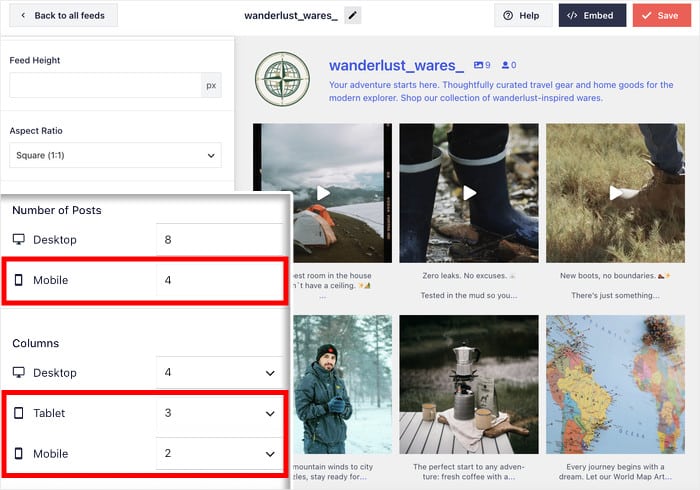
A phone screen is narrow, so fewer columns almost always look better. If desktop is 4 columns, drop mobile to 1 or 2, not 4.
That one change fixes most mobile layout problems on the spot.
Get a Feed That Matches Your Site on Every Screen
Instagram Feed Pro adds masonry, carousel, and highlight layouts on top of the customizer you just used, so your feed fits any space.
Get Full Layout ControlWhen Your Theme Is Overriding the Feed’s Styling
Sometimes you set your columns. You fixed your spacing. And it still won’t match what you see in the Customizer preview.
Here’s what’s going on. Your theme has its own CSS, the code that controls how things look. So does your feed. When both try to style the same thing, one has to win.
And if your theme’s CSS wins that fight, your feed loses its look.
Here are the signs your theme is the culprit.
- Your Customizer preview looks right, but the live feed looks wrong.
- Fonts, colors, or borders don’t match what you set.
- The problem stays after you adjust settings and save.
If that sounds like you, don’t reach for code yet. Custom CSS is the last step, not the first.
Try your settings first, then the AJAX theme loading fix in the next section. Most theme conflicts clear up right there. Only if both of those fail do you need custom CSS.
And when you do need it, put it in the right place. Add it under Appearance » Customize » Additional CSS, not your theme files.
If you’re using a block theme, go to Appearance » Editor » Styles, click the three-dot menu (⋮), and choose Additional CSS to paste your code.
This keeps your fix safe, so a theme update won’t wipe it out.
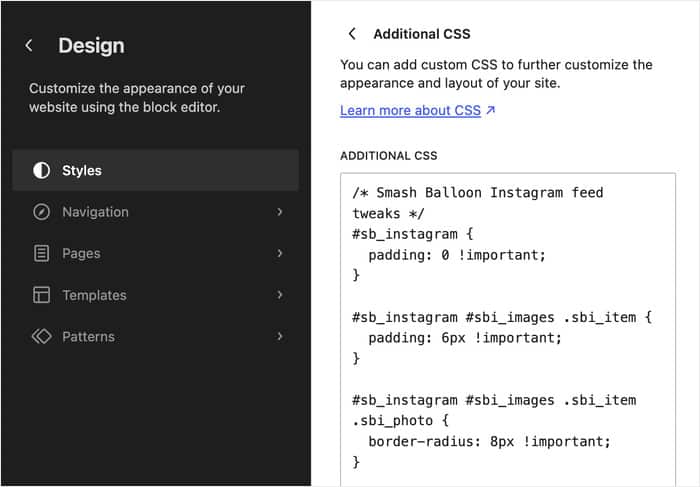
I’ll share a few safe overrides further down. For now, keep CSS in your back pocket. It’s for fine-tuning, once the simpler fixes are done.
Fix It With the AJAX Theme Loading Fix
Feed flashes unstyled for a split second, then snaps into place?
That’s a theme-load conflict. And there’s a one-click toggle that fixes it. No code.
Here’s what’s happening. Your theme and your feed both load their styles as the page opens. Sometimes the theme’s loading process gets in the way. So the feed paints raw for a moment before the styles catch up.
You have two ways to deal with this.
The manual way is to dig through your theme’s scripts. You’d hunt down the conflicting code and rework how it loads. That takes time, patience, and comfort with code most people don’t have.
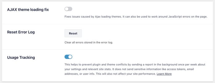
The easy way is a built-in setting called the AJAX theme loading fix. It loads the feed in a way that bypasses theme transition conflicts, so the styles apply correctly on the first paint. One checkbox does it.
Here’s where to find it.
- Open Instagram Feed » Settings » Advanced (or Facebook Feed » Settings » Advanced).
- Turn on the AJAX theme loading fix.
- Click “Save Changes”.
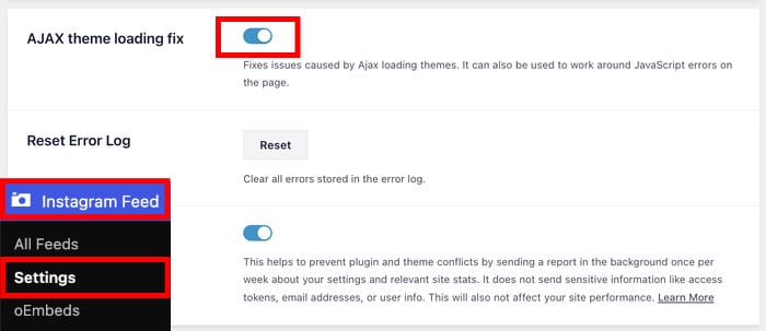
That clears the flash for most people right there.
Got odd or wrong image sizes too? There’s a fuller version of this fix.
In the same Settings » Advanced screen, turn on three settings together.
- AJAX theme loading fix
- Enqueue JavaScript in head
- JavaScript Image Loading
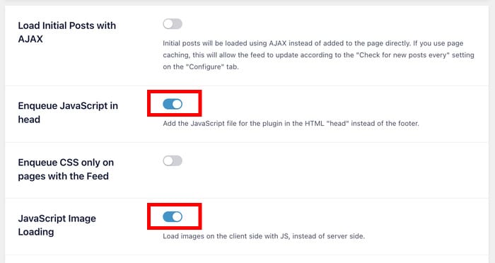
Click “Save Changes”. Then clear the plugin cache under the Feeds tab with “Clear All Caches”.
This makes the feed reload its images cleanly with the new settings.
One heads-up on lazy loading. If a lazy-load conflict is squashing your images, the fix runs the other way. Go to Settings » Advanced and turn off JavaScript Image Loading instead.
So these two are opposite levers. Turning on JavaScript Image Loading fixes some problems. Turning it off fixes others. Test one at a time, and check your feed after each change to see which one your site needs.
Safe Custom CSS Overrides That Won’t Break Your Theme
Still not right after all that? Now it’s time for a little CSS.
Here’s the good news first. You rarely get this far. A setting or the AJAX fix solves it for most people. If you’re reading this, you’re the exception, not the rule.
And these snippets won’t fight your theme. They’re small, targeted, and safe.
This is the manual lane, so it takes a bit more effort. You paste code instead of changing a value. But each snippet below does one simple job, and you can copy them straight in.
Here are four low-risk overrides to try.
- Tighten the space between posts. Use
#sb_instagram .sbi_photo { padding: 4px; }to shrink the gap. Lower the number for tighter, raise it for more room. - Force a consistent image height. Use
#sb_instagram .sbi_photo { height: 200px; }so every post matches. This fixes rows that look ragged or uneven. - Keep image shape consistent. Add
#sb_instagram .sbi_photo { background-size: cover; }so photos crop cleanly instead of stretching. - Adjust the column gap on mobile. Wrap your spacing rule in
@media (max-width: 480px) { ... }to change only the phone view, not the desktop.
Just open Appearance » Customize » Additional CSS and enter the CSS you want to use and test out how your feed works now.
If you’re on a block theme, you can instead open Appearance » Editor » Styles, click the three-dot menu (⋮), and click on Additional CSS.
One last step. After you save, clear the plugin cache under the Feeds tab with “Clear All Caches”. This makes your new styles show up right away.
That’s it. Tweak one snippet, save, check your feed, and repeat only if you need to.
Frequently Asked Questions
Why does my feed show the wrong number of columns on mobile?
Your mobile column setting is separate from your desktop one. Go to Customize » Layout and set the columns for the mobile breakpoint on their own. Drop it to 1 or 2 for a narrow phone screen.
Can I fully customize my feed’s design with CSS?
Yes, you can, but you usually won’t need to. The built-in live editor for Smash Balloon will cover most cases. Save CSS for last-mile tweaks if the live editor doesn’t give you the option you need.
Why does my feed look unstyled for a second when the page loads?
That flash is a theme-load conflict, not a bug. Turn on the AJAX theme loading fix under Settings » Advanced, then click “Save Changes”. It clears the flash for most people.
Does changing my theme reset my feed layout settings?
No, your feed settings stay saved when you switch themes. But the new theme’s CSS can override how the feed looks. Re-check for specificity conflicts, and re-apply the AJAX theme loading fix if you need it.
Do I need coding knowledge to fix a layout issue?
No, you don’t. Almost every layout issue is a toggle or slider in the feed customizer. There’s no code to write, even if you’re not a tech wizard.
A Feed That Actually Matches Your Site
A broken-looking feed is rarely broken at all. It’s almost always a setting.
Match your symptom to the cause first. Fix the setting before you touch the stylesheet. And for most people, the fix is one click, not one line of code.
You’ve got the built-in layout controls for columns and spacing. You’ve got separate mobile settings for phone screens. And you’ve got the AJAX theme loading fix for that split-second flash. Custom CSS is there too, but only for the rare last-mile tweak.
Want your embeds to look just as sharp everywhere else on your site? These guides walk you through it step by step:
- Add a responsive Instagram embed to WordPress
- Add a responsive Facebook video embed
- Add a responsive Twitter embed
Start Fixing Your Feed Layout Now
Grab Instagram Feed Pro or Facebook Feed Pro and get feeds that match your site on every screen.